
Secretary of State Marco Rubio has formally changed the State Department’s official font from Calibri to Times New Roman, dismissing the old choice as “informal” and a “wasteful” paean to diversity.
“The United States is breaking up with a font because it’s just not their type,” said Politico. “This being the Trump administration, it was something of a surprise that the font Trump Mediaeval wasn’t chosen”. That’s “not a description of how Ice raids are conducted” but an actual font dating from 1954.
‘Fraught politics of typefaces’
Rubio “waded into the surprisingly fraught politics of typefaces” to reverse a 2023 directive under the Biden administration, which aimed to improve the accessibility of department material for readers with disabilities, said The New York Times. Biden’s move, orchestrated by the then secretary of state Antony Blinken, was made following the recommendation of the State Department’s office of diversity and inclusion, an organisation that Rubio has since abolished.
The switch to the more traditional Times New Roman would “restore decorum and professionalism to the department’s written work”, said Rubio in an internal memo seen by The New York Times. The memo – titled “Return to Tradition: Times New Roman 14-Point Font Required for All Department Paper” – can be seen as “the latest attempt by the Trump administration to stamp out remnants of diversity initiatives across the federal government”.
History is full of significant “typographic disputes”, said Robrecht Vanderbeeken in Diggit Magazine. For example, the Vatican introduced its own printing press in the 16th century that used “exclusively Roman Antiqua”, while Louis XIV demanded an “exclusive royal typeface”: the Romain du Roi. “Is it only a matter of time before Trump wants his own golden font?”
‘Ideological straitjacket’
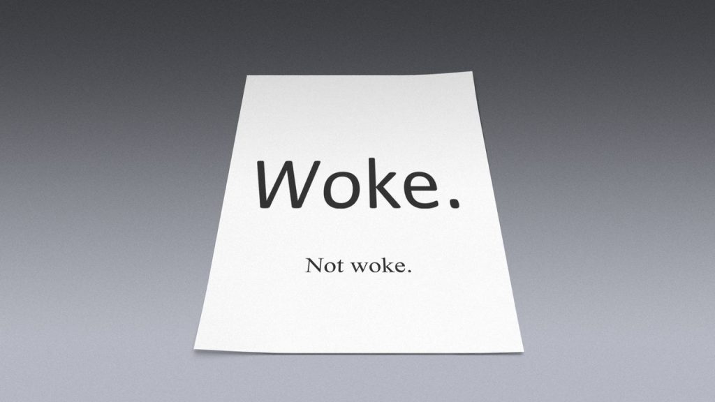
“A ban on Calibri may seem banal, but it reveals a deeper fear of freedom,” said Vanderbeeken. The font shift has become the “latest battleground in the culture war of Trumpism”, with Times New Roman being given an “entirely new ideological connotation”.
The fact that Calibri “is being targeted is no coincidence”. Popularised by Microsoft in the mid-2000s as a sans serif font (so it doesn’t have those “small cross-strokes at the ends of each letter stem”), its letters convey “neutrality, universality, and technical suitability”. But even though Calibri is more accessible, supports more languages and is better suited for reading on screen, the Trump administration sees it as too “woke”. Times New Roman thus becomes an “ideological straitjacket” for the communication of public policy.
“There’s nothing woke in it, maybe just a friendliness,” Calibri’s creator, Lucas de Groot, told Wallpaper*. “I try to design with a little bit of a humanistic touch” as the “subtle voice a typeface transmits is really important in conveying messages”.
The move can only be seen as yet another episode in the “unceasing efforts to root out DEI (or in this case DEIA)”, said Bloomberg, emphasising the “accessibility” part of the acronym. It highlights how the department even “pitches aesthetic minutia into sharp partisan relief”.
As the State Department shifts from Calibri to Times New Roman, is this just a ‘typographic dispute’, or the ‘latest battleground’ of a culture war